UX audit and website redesign
Date: 2021
BranDeScie&Cie.com
Brandescieetscie is a portable sawmill distributor. I was commissionned to evaluate their website to improve the user experience and redesign the platform to increase conversion rate
This audit was used with the Capian Ux evaluation Chrome extension
Try it for free here: www.capian.co
This tool was incredibly simple to use. It also features a mobile app, which is perfect for a complete responsive evaluation. You can choose which criteria standards you want to use, or create your own.
See the complete audit (french) here.
Evaluation method
My audit was made by applying Amélie Boucher's 12 Usability Criterias. Since I was reading one of her literary work, I was eager to apply it to a real-world project.
Key findings
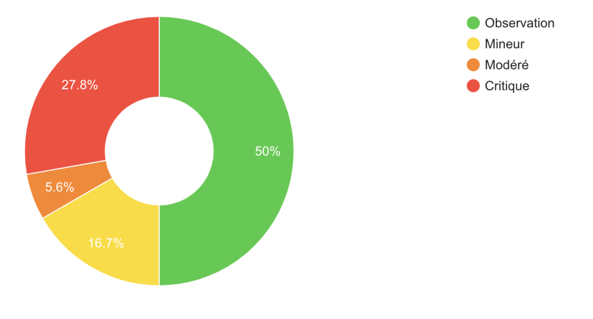
During the initial Audit, I found a lot of usability issues. The website navigation was not consistent and the information architecture was scattered.
While most of the issues were not severe. Here's a pie chart that distribute issues by severity.
1. Lack of global visual consistency
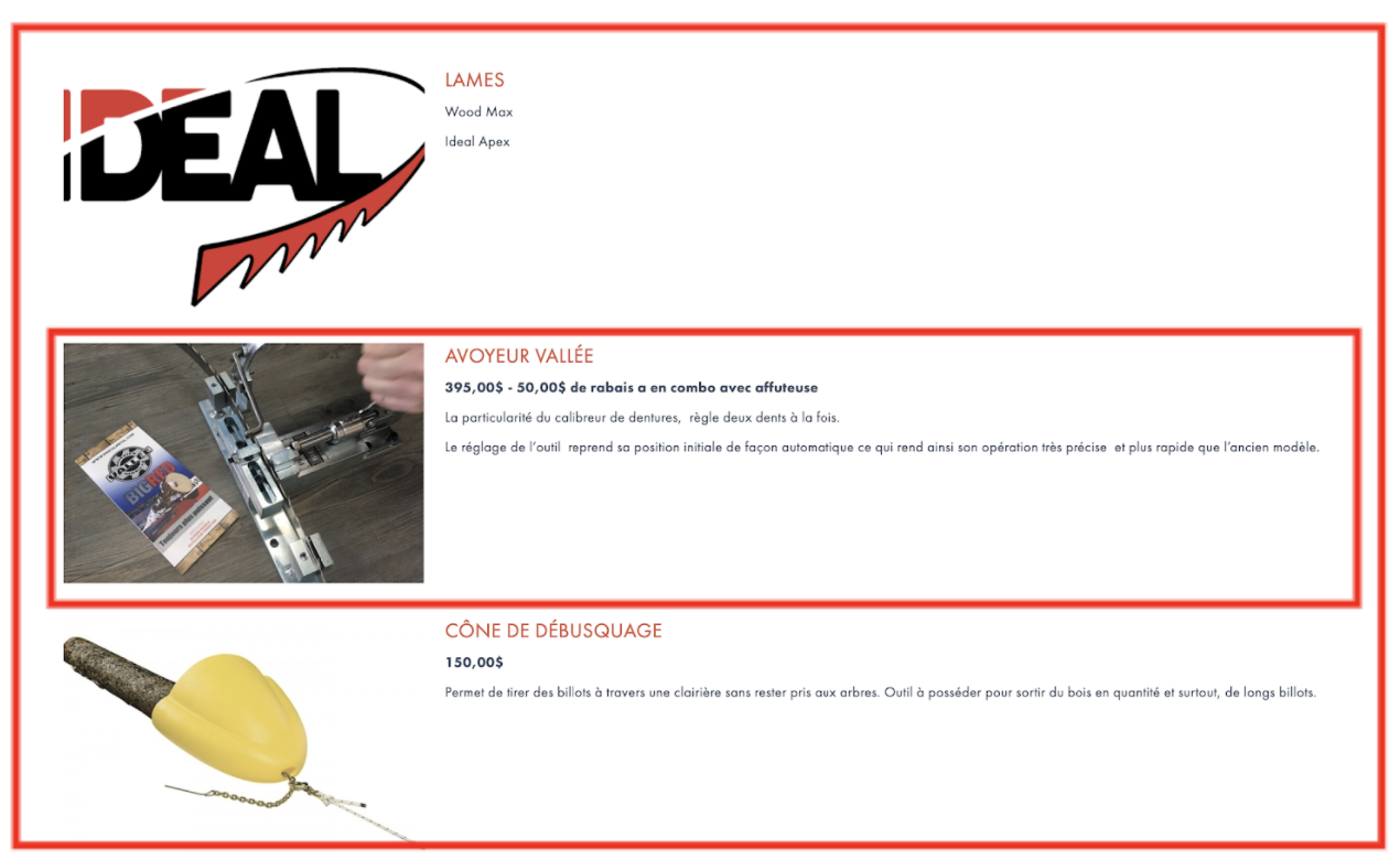
Amongst High severity issues, there was the lack of global consistency of the UI. While aesthetics is not our main concern here, some listed products didn't looked like "buyable" products. Some of them didn't even have a listed price.
Solutions
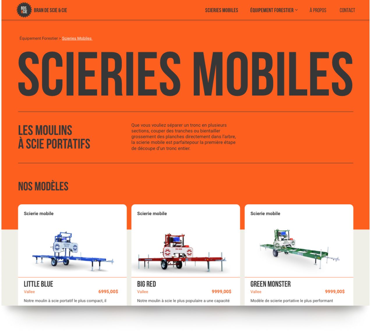
1. Build standardized product cards.
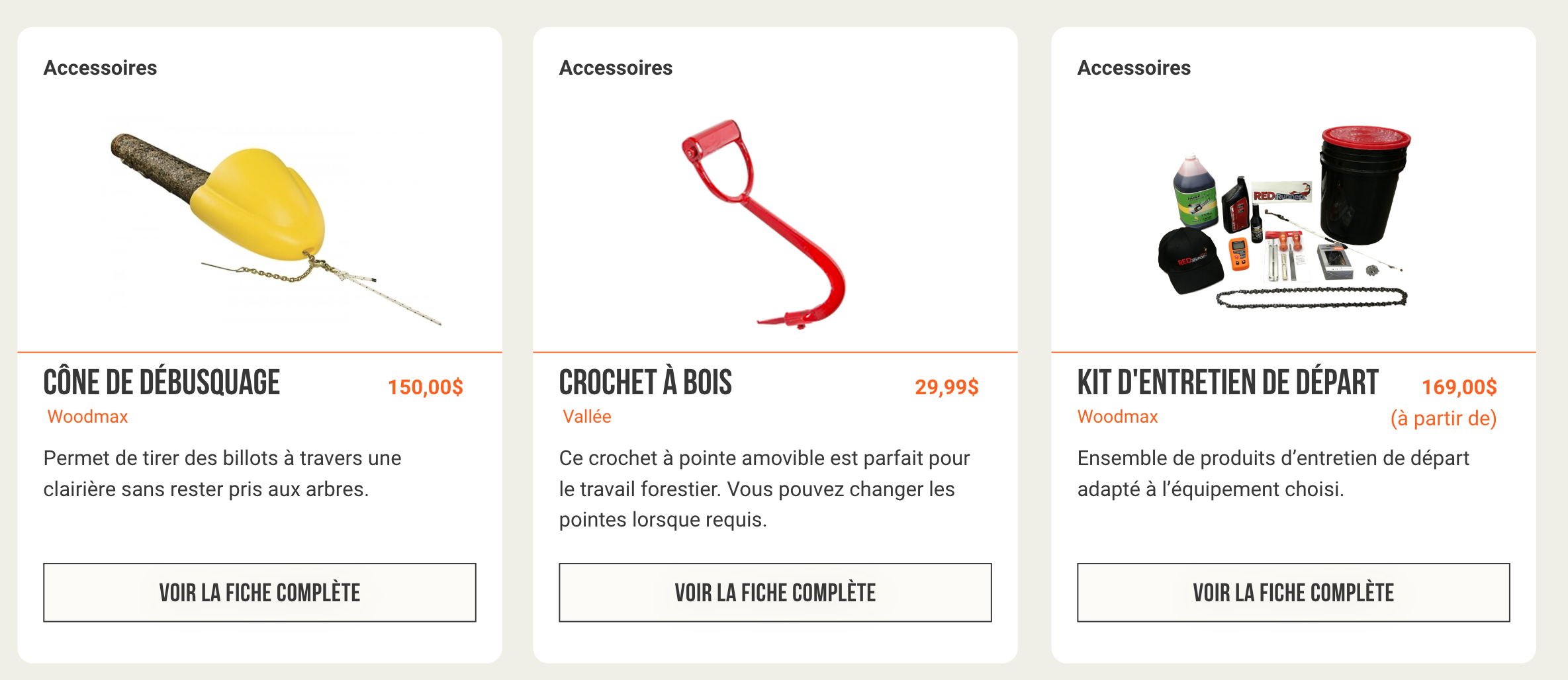
Final results

William Gauvin