Rebranding a mobile app
Date: 2019
HOP app

This is a sub-story of the HOP Mobile App
After a year of adding features to the app, we felt like the initial branding was not reflecting the feeling we wanted. HOP rewards employees for their healthy behaviour, and the previous branding was a bit too dull.
The app Icon
This is the original logo. The marketing team was not happy with the result, as stated before. They wanted something more dynamic, structured and something that referred to the content of the app.

Here are some of the sketches I made:
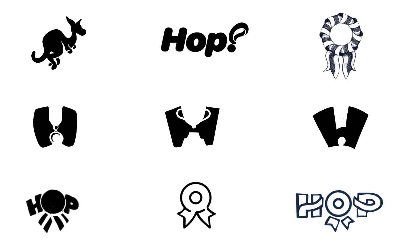
The team liked the idea of a medal, or badge since the app was based on unlocking badges to earn coins.
In the last sketch, I tried to merge the notion of a badge, and a target. The intention was to reach your target to obtain a reward.
It is indeed, the last one that was selected.
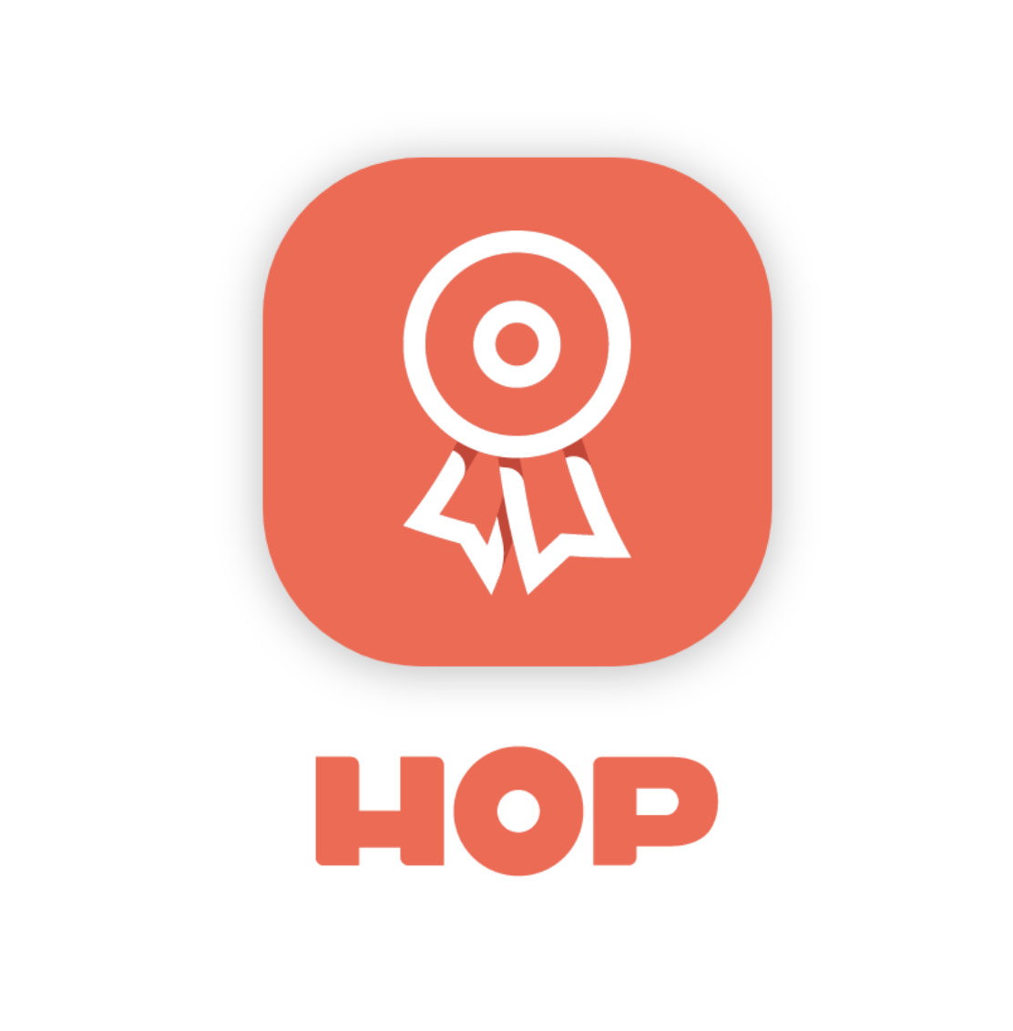
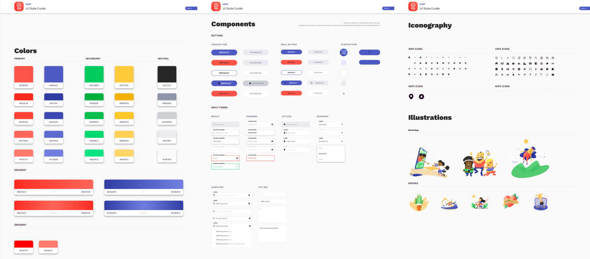
The User Interface
With this new branding, I had to adapt the UI. I started by updating the style guide. Here's a glimpse of what it looked like:
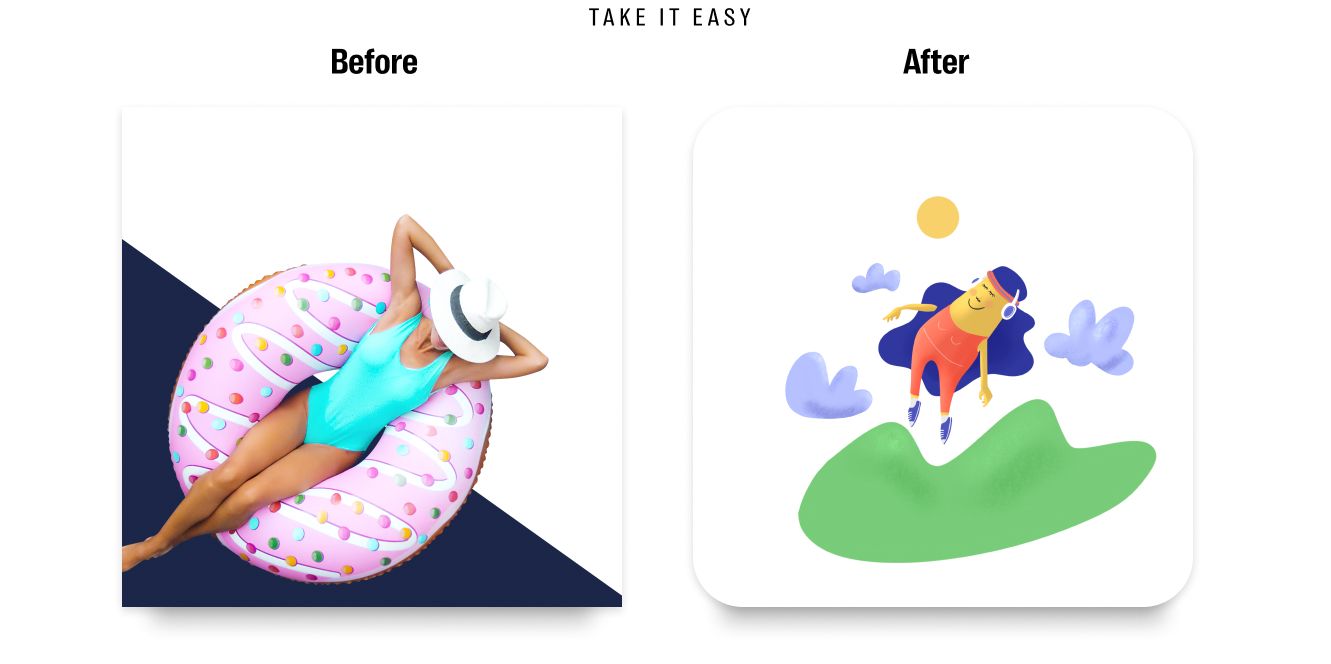
The Badges
Since the branding changes affected the in-app badges, they had to be redesigned. We chose an illustration style over a stock photo montage.

William Gauvin